

PROJECT
Redesign website and logo
SUMMARY
I was the lead designer in redesigning the entire website for the 3 user level (State, Region Manager, and Grant Contact). Depending on the user the dashboard view would vary.
I was also in charge of updating the logo.
ROLE
Lead UI/UX Designer
November 2023-May 2024
PROJECT BACKGROUND
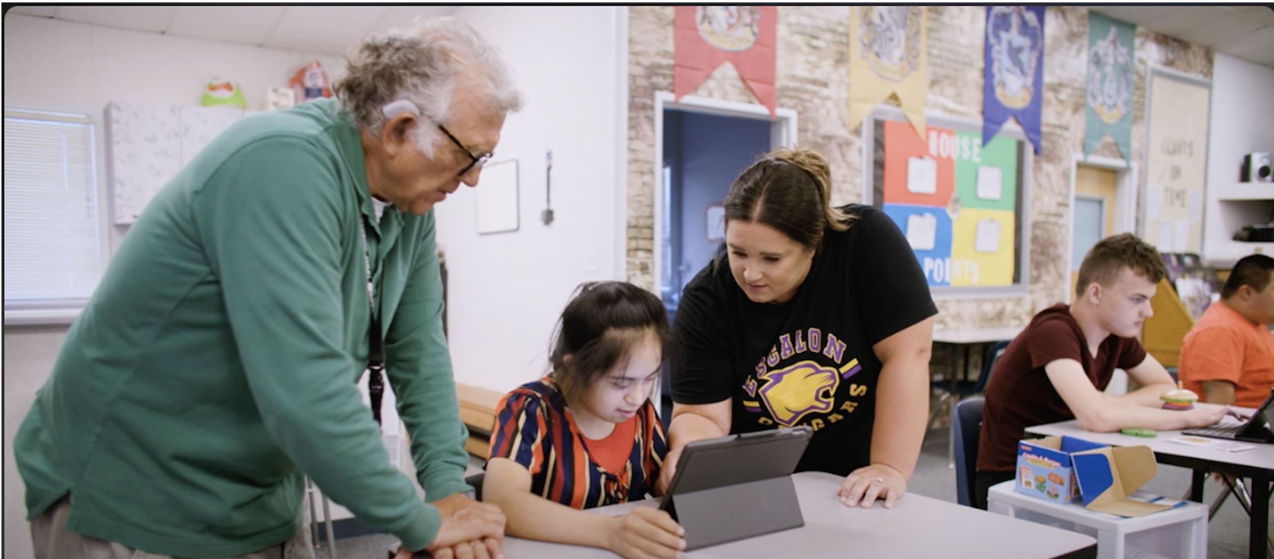
WorkAbility l is a state funded program that provides real life work skills and experience for high school students in special education.
The program helps prepare the students for life outside of school - the services are tailored to the student’s needs, abilities and interests.

ADDRESSING THE PROBLEM
Besides the website being visually outdated, one of the biggest headaches for the client was the amount of clicking and searching it took to find the information he needed. It wasn’t just him either, every one who had to use the website shared the same exact frustration.
Over a Zoom call, the client walked us (me, my team and the program manager) through the website and explained the purpose of the various different pages and the frustrations he experiences trying to search for the information he needed.
This was such an important part in the process of redesign because I was able to hear and see first hand the amount of pain the user experiences from using the old website.
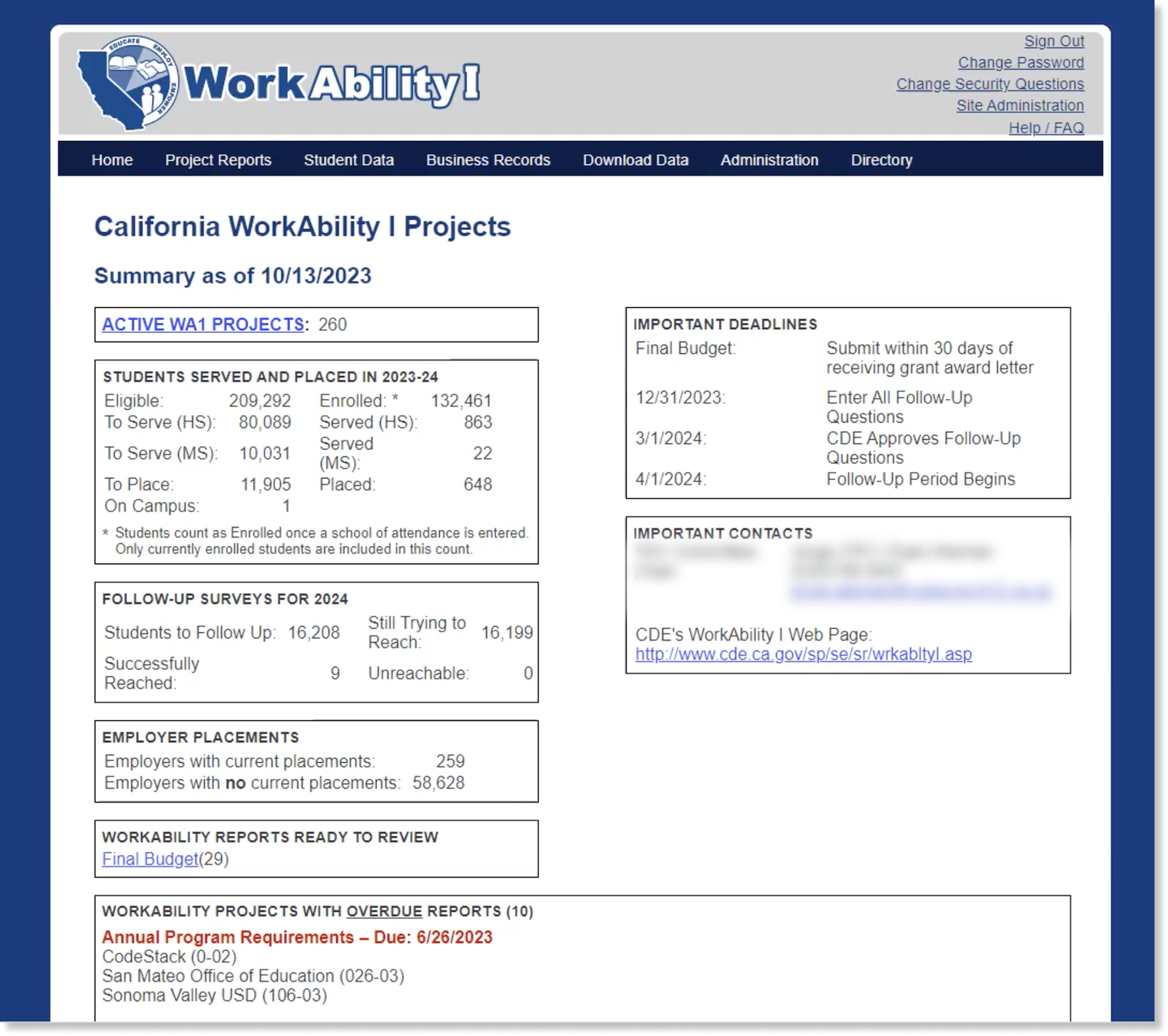
Old Dashboard Design
WEBSITE AUDIT
The first step in the redesign was to conduct an audit of the whole website. Using the notes from the Zoom call as a reference I jotted down notes about the function the dashboard and the other pages.
One of the most difficult features of the website was the dashboard because the client wanted to keep all the information and also wanted to features. The features on the current dashboard had static information. There was a section of Overdue Reports with a list of schools with overdue reports that fluctuates from a short to a very very very long list.
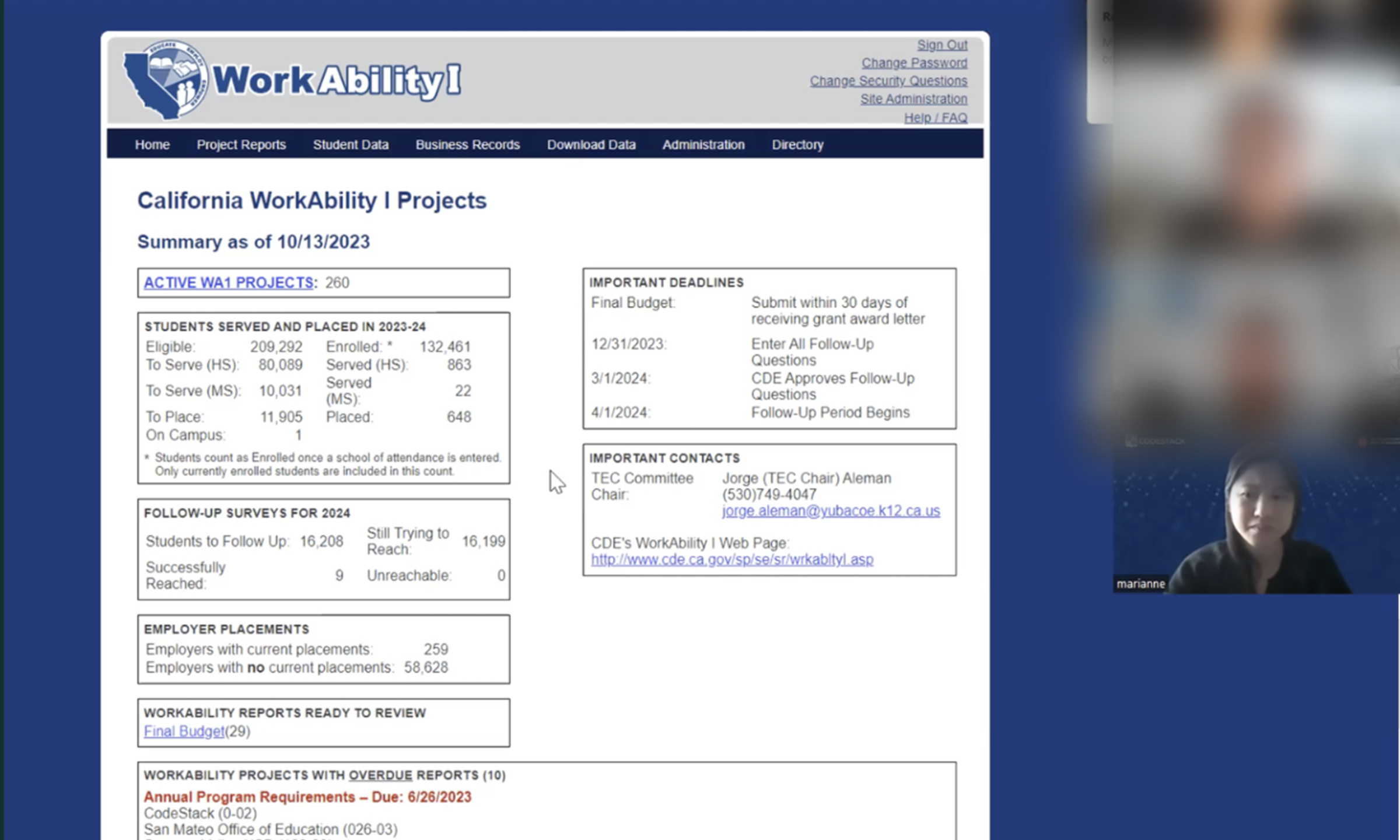
Zoom call with the client
WHAT DID I DO??
Color Theme - During the Zoom meeting, the client mentioned they didn’t like the color of the current website (dark navy blue) because it felt outdated and needed to be changed. I decided to use a dark forest green to represent growth and independence of the students in program.
Dashboard- When I redesigned the dashboard I wanted to make it as easy as possible for the different user to find the information quickly. Since the client wanted to keep all the information (and more) I refreshed the look of the cards to be more up to date.
Using the notes from the meeting I was able to figure out what pages were important for the client and added additional cards to help increase efficiency. One of the added features I added was the Project Report Status which showed all the reports status. Having this feature was a game changer to help the client keep track of the reports.
Dashboard Search Filter - Another feature that was implemented in the design was adding a search filter at the top of the dashboard for the user to search for grant contacts, projects and school quickly without having to jump from one to another to find the information.
Logo - The client wanted to update the look of the logo to be more modern. They wanted to keep the image but the style of the word can be changed. I had to recreate and design the new logo in Illustrator.
Various pages - I updated the look and functionality to make it easier to use.

Old Logo
New Logo
Final Thoughts
Redesigning the WorkAbility l website has been one of the most impactful project I have worked on so far because I was able to help increase the productivity and efficiency of the user.